Introduction
Nokia 1 to 10 - a Nokia for everyone. Well, we're getting there - after the famed brand's return with the Nokia 6 in early 2017, the 5 and 3 followed, and then the flagship Nokia 8 came to be. The 7 showed up later filling one of the gaps, though not everywhere in the world - like the others, actually. The portfolio's expansion continues into the entry-level segment with the Nokia 2 - a budget model if there ever was one, priced around the $100 mark.
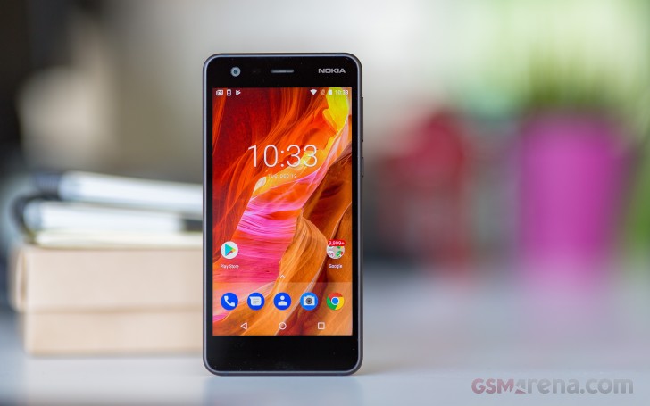 What that gets you in Nokia world is a 5-inch 720p display - pretty
great at this price point if you ask us. Going by the numbers, it could
be the same as the one on the Nokia 3, so thumbs up to Nokia for not
digging up a qHD panel (small 'q' - 540x960px) long forgotten in some
distant warehouse. It's covered with Gorilla Glass 3, so there's no
complaints about that either.
What that gets you in Nokia world is a 5-inch 720p display - pretty
great at this price point if you ask us. Going by the numbers, it could
be the same as the one on the Nokia 3, so thumbs up to Nokia for not
digging up a qHD panel (small 'q' - 540x960px) long forgotten in some
distant warehouse. It's covered with Gorilla Glass 3, so there's no
complaints about that either.Where things start looking gloomy is the chipset - the Snapdragon 212 is an old dog, a minor upgrade to the 210, neither of which is particularly quick. And that's just us being polite. A single gigabyte of RAM and 8GB of storage further reinforce the feeling we're looking at a smartwatch specsheet.
Smartwatches don't typically have cameras, and we certainly haven't heard of ones with two shooters. The Nokia 2 is no wearable and does have a pair - an 8MP camera on the back, and a 5MP front-facing unit. Nothing fancy, obviously.
What it lacks in oomph, the Nokia 2 makes up for in battery - a 4,100mAh power pack promises plenty of on time, 2 days Nokia says. We'll see about that.
There are goodies you won't find on most flagships though - like the dedicated microSD slot, whether the Nokia 2 is single or dual SIM. There's an FM radio receiver too, beat that, Pixel 2!
Nokia 2 key features
- Body: Aluminum frame, removable plastic back, Gorilla Glass 3 front.
- Display: 5.0" LTPS IPS LCD, 1,280x720px resolution, 294 ppi.
- Rear cameras: 8MP, f/2.6 aperture, autofocus; LED flash; 720p video recording.
- Front camera: 5MP, f/2.6 aperture; fixed focus; 720p video recording.
- OS/Software: Android 7.1.1 Nougat.
- Chipset: Qualcomm Snapdragon 212: quad-core 1.3GHz Cortex-A& CPU, Adreno 304 GPU.
- Memory: 1GB of RAM; 8GB of storage; dedicated microSD slot.
- Battery: 4,100mAh Li-Ion (sealed).
- Connectivity: Single SIM and dual SIM versions, market dependent; Cat. 4 LTE (150Mbps/50Mbps); microUSB 2.0; Wi-Fi b/g/n; GPS, GLONASS, BDS; no NFC; Bluetooth 4.1.
- Misc:FM radio, 3.5mm jack, back-firing single speaker.
Now, if we weren't thrilled with the Nokia 3's performance when we had it over for review, what does that say about the humble 2? Nothing, not yet at least - we'll be evaluating it on its own merits. Let's get it out of its box first.
Retail box
The Nokia 2 comes in an unassuming small cardboard box with the phone printed on top, in a 'connecting people' context, of course. Jokes aside, there's everything to get you started: a 5V/2A charger, a USB cable, and even a basic headset.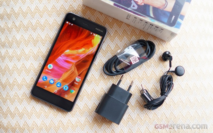
Design
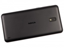
The Nokia 2 is a rather unassuming, but well built phone. There's a metal frame all around it, and despite the color scheme being called Pewter/Black, the frame is not made of pewter, but is aluminum instead. It feels nicely cold and expensive, that latter enhanced by the non-black pewter color.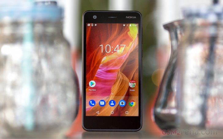 The back, on the other hand, is very much black and unmistakably
plastic. That's not a bad thing in and of itself - we've repeatedly
insisted that there's nothing wrong with plastic on a phone. This one in
particular does tend to smudge and is not very easy to clean, but the
prints aren't all that visible.
The back, on the other hand, is very much black and unmistakably
plastic. That's not a bad thing in and of itself - we've repeatedly
insisted that there's nothing wrong with plastic on a phone. This one in
particular does tend to smudge and is not very easy to clean, but the
prints aren't all that visible.One good thing about the back cover is that it's removable - yay. Only the battery isn't - bummer. Still, a removable cover can be easily replaced if broken or all scratched up. Another positive side of this approach is that you don't need a pin to insert a SIM card or a memory card - we had a hundred pins at the office at one time (thanks, Victor!), but lately it's been a quest finding one - point being pins get lost.
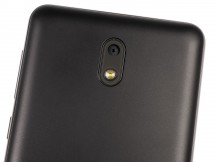
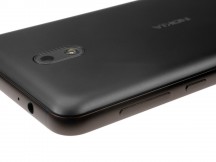
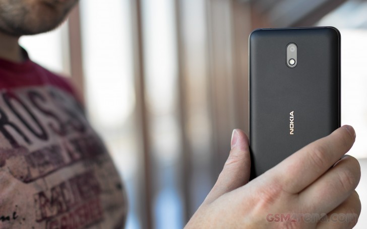 There's a Nokia logo in the middle of the back cover, a shiny
recessed one. A cutout in the panel lets the camera take a peek at the
world, its LED flash nearby. The loudspeaker is down in the right
corner, a placement we've come to see less often. There's a small pimple
that prevents it from being muffled when the phone is lying flat on a
hard surface.
There's a Nokia logo in the middle of the back cover, a shiny
recessed one. A cutout in the panel lets the camera take a peek at the
world, its LED flash nearby. The loudspeaker is down in the right
corner, a placement we've come to see less often. There's a small pimple
that prevents it from being muffled when the phone is lying flat on a
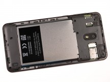
hard surface.Pop the cover off, and you'll see a nano SIM slot on either side of the phone. The left one is a simple slide in type, while the right one is a push-to-insert, push-to-eject affair. The rationale likely is that the right SIM slot is underneath the microSD slot, so the push action saves you the hassle of having to remove the memory card to get at the SIM card. Oh, yes, you can have all three cards in at the same time, the microSD gets its own dedicated slot.
Perhaps you got overly excited hearing of a removable back cover thinking you can swap out the battery too - we know we did. Sadly, that's not the case - you have at least a dozen screws of two different sizes standing in your way - not impossible, just not something you'd be doing on a daily basis.
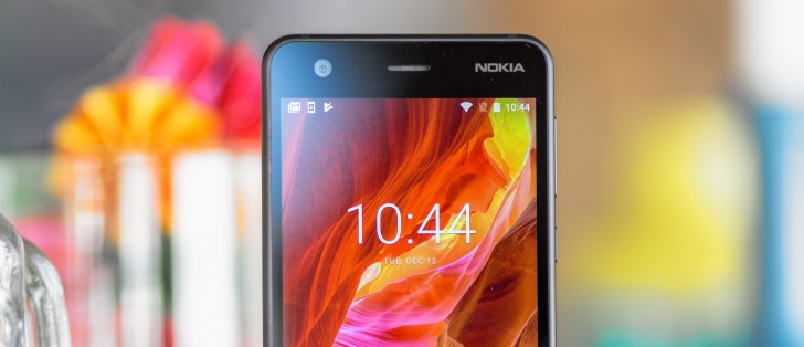
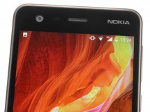
Snap the cover back on and flip the phone to see another Nokia logo greet you from the top right corner above the 5-inch display. The earpiece is in the middle, duh, and right next to it are the proximity and ambient light sensors, with the 5MP front camera further to the left. Unfortunately, there's no notification LED.
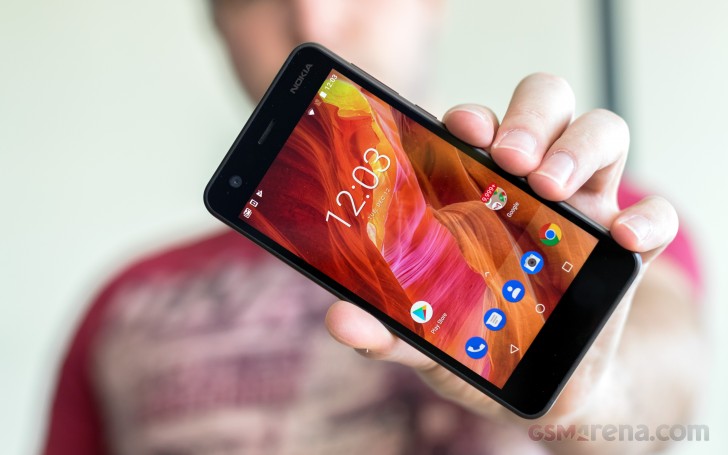 There's nothing in the bottom bezel, at least nothing immediately
usable on the front - there's certainly stuff inside. So yes, there's
plenty of meat around the display - the Nokia 2 makes no bold full
screen promises and is a classic chunky bar.
There's nothing in the bottom bezel, at least nothing immediately
usable on the front - there's certainly stuff inside. So yes, there's
plenty of meat around the display - the Nokia 2 makes no bold full
screen promises and is a classic chunky bar.The power button and the volume rocker are on the right side. Even if we tend to advocate for putting them on opposite sides, in this case the power button is below the volume rocker and the placement works much better than the reverse arrangement you'd find, say, on a Pixel 2 - that's a hat trick of things the Nokia 2 does better than the Pixel 2.
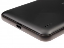
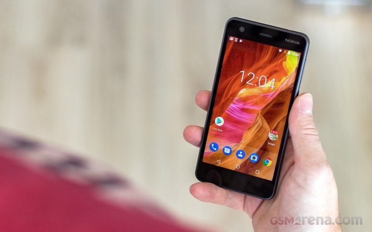 On the bottom, you'll find the microUSB 2.0 port - apparently USB-C
is still too expensive. Right next to it is the groove in the aluminum
frame where you need to stick your fingernail to get the back cover off -
neat. The primary mic gets its own dedicated pinhole.
On the bottom, you'll find the microUSB 2.0 port - apparently USB-C
is still too expensive. Right next to it is the groove in the aluminum
frame where you need to stick your fingernail to get the back cover off -
neat. The primary mic gets its own dedicated pinhole.Another pinhole can be found on top, this one for the secondary mic. The 3.5mm jack is also here.
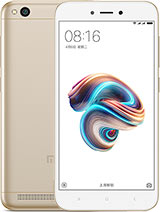
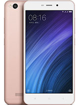
The Nokia 2 measures 143.5 x 71.3 x 9.3 mm which is a few millimeters taller and about a mil wider than the competing Redmis of the world - 4, 4A, and 5A. The Nokia is heavier than all of them too - its 161g are closer to the Redmi 4's 150g, while the As are in the 130-somethings. That said, the Nokia 2 doesn't really feel too heavy.
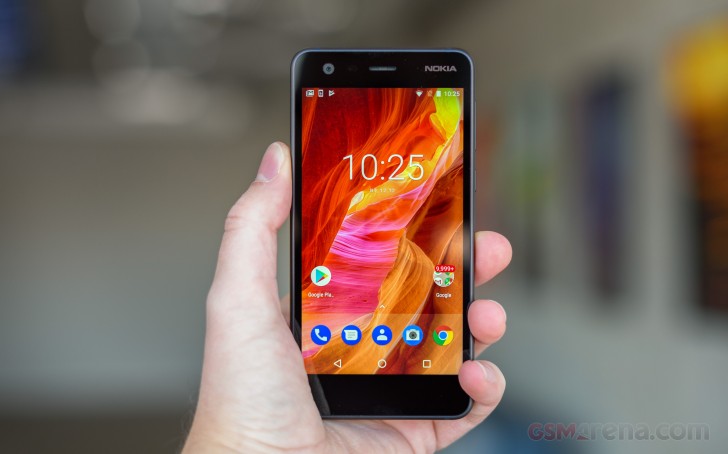
The 5-inch 720p display performs above its pay grade
The Nokia 2 is equipped with a 5-inch display of the IPS LCD variety. The 720p resolution results in a 294ppi density, which isn't half bad on a $100 phone.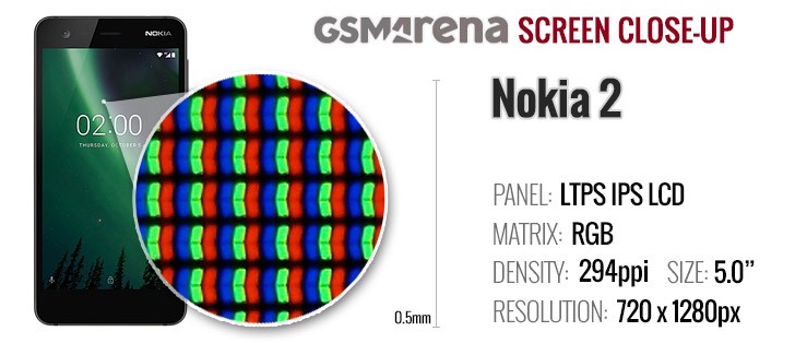 It performed quite well in our testing too, achieving a maximum
brightness of 500nits and change. Its blacks aren't spectacularly deep,
but are still well controlled and that makes for more than decent 1227:1
contrast ratio. Budget offerings are typically under 1000:1, Samsung's
AMOLEDs excluded, and even so, the J5 (2017) is twice the price of a
Nokia 2.
It performed quite well in our testing too, achieving a maximum
brightness of 500nits and change. Its blacks aren't spectacularly deep,
but are still well controlled and that makes for more than decent 1227:1
contrast ratio. Budget offerings are typically under 1000:1, Samsung's
AMOLEDs excluded, and even so, the J5 (2017) is twice the price of a
Nokia 2.| Display test | 100% brightness | ||
| Black, cd/m2 | White, cd/m2 | ||
| 0.409 | 502 | 1227 | |
| 0.353 | 477 | 1351 | |
| 0.69 | 632 | 916 | |
| 0.513 | 475 | 925 | |
| 0.576 | 527 | 915 | |
| 0 | 326 | ∞ | |
| 0 | 485 | ∞ | |
| 0.47 | 450 | 957 | |
| 0.571 | 531 | 930 | |
| 0.426 | 407 | 955 | |
Color reproduction isn't overly accurate - the Nokia 2 posted an average Delta of 5.3, which is fine. White, however, has a strong blue shift (DeltaE around 8) and grays are similarly off. Colors in the blue/purple part of the spectrum are even further from the truth. Nothing you can't learn to live with, really, especially if you refrain from comparing against more color-accurate displays.
Nokia 2 battery life
One of the key selling points of the Nokia 2 is battery life. Or rather the prospect of a great battery life drawn by the combination of a 4,100mAh power pack, humble chipset, and comparatively small screen.And indeed the Nokia 2 does deliver in this department. In our testing, it lasted for fourteen and a half hours in both video playback and web browsing - quite impressive. The 28+ hours of talk time on a 3G network were pretty nice too. Factor in the standby (which we do measure, but it doesn't make it into the score card), and the Nokia 2 posted a 109h Endurance rating.
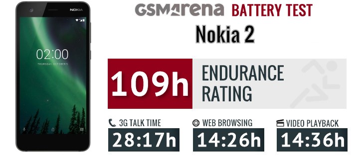
Our endurance
rating denotes how long a single battery charge will last you if you
use the Nokia 2 for an hour each of telephony, web browsing, and video
playback daily. We've established this usage pattern so our battery
results are comparable across devices in the most common day-to-day
tasks. The battery testing procedure is described in detail in case you're interested in the nitty-gritties. You can also check out our complete battery test table, where you can see how all of the smartphones we've tested will compare under your own typical use.
As for charging, the Nokia 2 is best topped up at night. A full
charge from flat with the bundled adapter takes a pretty sluggish four
and a half hours, while half an hour will only get you from 0 to 10%.Audio output fails to impress
The Nokia 2 let its low-end nature shine through in the audio quality test. The handset had pretty distorted output when connected to an active external amplifier and while things were actually decent with headphones it was hardly a performance worth writing home about.Volume was below average with an external amplifier and plunged even lower in the second part of the test to prove that the Nokia 2 is far from the most talented musician around. It can play tracks, but if you really care about the quality, you might want to check your other options.
| Test | Frequency response | Noise level | Dynamic range | THD | IMD + Noise | Stereo crosstalk |
| +0.15, -0.23 | -53.2 | 86.4 | 0.0021 | 3.246 | -96.2 | |
| +0.02, -0.08 | -89.5 | 89.9 | 0.0023 | 0.026 | -59.3 | |
| +0.03, -0.05 | -85.0 | 88.8 | 0.0014 | 0.0065 | -92.9 | |
| +0.14, -0.04 | -91.8 | 91.8 | 0.0031 | 0.113 | -56.8 | |
| +0.06, -0.08 | -93.5 | 93.3 | 0.0020 | 0.0071 | -93.2 | |
| +0.64, -0.07 | -89.3 | 91.3 | 0.0093 | 0.361 | -52.0 | |
| +0.01, -0.03 | -92.8 | 92.8 | 0.0032 | 0.031 | -92.3 | |
| +0.23, -0.15 | -92.1 | 91.8 | 0.013 | 0.223 | -77.3 | |
| +0.04, -0.02 | -88.2 | 88.6 | 0.011 | 0.021 | -84.3 | |
| +0.13, -0.05 | -87.4 | 87.7 | 0.014 | 0.084 | -75.9 |
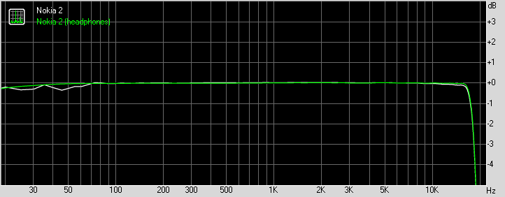
Nokia 2 frequency response
You can learn more about the tested parameters and the whole testing process here.
Loudspeaker
The Nokia 2 has a single loudspeaker in a somewhat outdated rear-firing position. There's a small pimple to raise the phone slightly when lying on a table, thus keeping the speaker from getting muffled. And that works.The speaker is reasonably loud too, pumping out enough decibels to make for a Good rating in our three-pronged test. The Nokia 5 fell in the same category, while the 3 was a notch louder (Very Good) and the 8 was up there with the best in the Excellent bowl. Chief competitors from camp Xiaomi aren't as loud as the Nokia 2, so there's that.
| Speakerphone test | Voice, dB | Ringing | Overall score | ||
| 61.6 | 66.2 | 68.3 | Below Average | ||
| 62.0 | 67.5 | 69.4 | Below Average | ||
| 62.8 | 67.5 | 72.1 | Average | ||
| 64.8 | 70.1 | 72.0 | Average | ||
| 64.7 | 70.4 | 72.3 | Average | ||
| 66.7 | 70.6 | 75.0 | Good | ||
| 68.5 | 72.2 | 72.8 | Good | ||
| 63.9 | 70.0 | 81.7 | Good | ||
| 63.1 | 70.9 | 82.5 | Good | ||
| 65.4 | 69.1 | 84.2 | Good | ||
| 68.0 | 70.2 | 82.3 | Very Good | ||
| 70.6 | 71.0 | 83.6 | Very Good | ||
| 88.0 | 77.1 | 81.4 | Excellent | ||
| 91.5 | 74.3 | 83.2 | Excellent |
Software
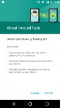
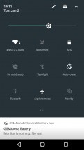
The Nokia 2 runs Android 7.1.1 Nougat. Oreo has been promised - a jump straight to v8.1, too. With that, the entry-level Nokia will get a much needed Android Go performance boost, or at least in theory it should. But there's no time frame for the update, so let's not get ahead of ourselves.Much like the other members of the new Nokia roster, the Nokia 2's take on Android stays close to Google's own. The one customization is the blue theming of the stock icons. The lockscreen is as standard as they come, while the app drawer is the pull-up one introduced with Nougat on the original Pixel. There's face unlock, or rather 'trusted face', which, to reiterate, is a built-in Android feature.
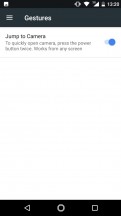
There are a couple of basic gestures like flip to mute, and a double press on the power button will launch the camera from any screen. There is, actually, multi-window! Yes, it does come as standard with Nougat, but the Nokia 2 struggles dealing with one app at a time, so it's quite impressive that it can at all display two side by side. Well, it somehow manages.
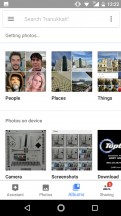
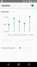
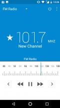
As for multimedia, it's all in the hands of Google and its default apps. Google Photos is in charge of gallery-related tasks and video playback, while Google Play Music is the audio player. There's an FM radio too.
Performance
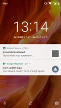
The Nokia 2 is powered by the Snapdragon 212 chipset, though 'powered' might be too strong a word for a Snapdragon that is anything but snappy. A modest quad-core CPU relying on dated Cortex-A7 cores clocked at 1.3GHz is paired with just a single gig of RAM. Similar configurations can be found on smartwatches.Storage is a rather crippling 8GB, too - no microSD app installs can convincingly make up for that, though yes, the Nokia 2 can do it. We frown upon 16GB phones, and 8GB is just too little. For example, after a walk around the park for gathering some photo samples - no more than a 100 photos in this case - it refused to install Geekbench off the Play store, citing lack of storage. That's with no additional apps on board, other than the standard Google package.
Obviously, we freed some space and did run the benchmarks. In the multi-core GeekBench the Nokia 2 puts out a score less than half the Nokia 5's. Even the Nokia 3, itself packing a quad-core CPU, is more powerful than the 2 by a wide margin - 4x53>4x7, Cortexes, that is. Making an even better case for the A53s are the Xiaomis - both the Snapdragon 425 and 435 have a significant advantage in CPU power over the Nokia 2's Snapdragon 212.
This is the part where we often say 'yes, this and that phone doesn't excel in benchmarks, put is perfectly okay and smooth in everyday use'. Well, the Nokia 2 isn't. It's slow, there's no escaping that. It feels just as slow as its outdated hardware would suggest, and even basic browsing around the UI can leave you waiting at times. Such is life. At least until the phone receives the 8.1 Oreo update and with it some Android Go memory management improvements. Realistically, however, it's better to have your expectations managed rather than the limited amount of memory on the phone.
Camera
The Nokia 2 is equipped with an 8MP primary camera on its back with what EXIF data points is an f/2.6 aperture lens - Nokia doesn't list it in the specs. It's a pretty wide angle lens too, though again, it's not specified and EXIF doesn't cooperate with a 35mm equivalent - 2.83mm means little without sensor size. The camera lacks OIS, rather predictably, but does have autofocus, while an LED flash will help in complete darkness.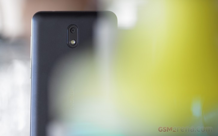 The camera app is the same you'd find on other Nokias - one of very
few custom jobs the 2's software has on offer. To reiterate our
long-standing stance on the matter, the app is simple in some ways, but
also potentially confusing and overcrowded if misused.
The camera app is the same you'd find on other Nokias - one of very
few custom jobs the 2's software has on offer. To reiterate our
long-standing stance on the matter, the app is simple in some ways, but
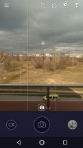
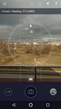
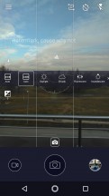
also potentially confusing and overcrowded if misused.In the main view, you get a shutter release on the bottom, a switch to video mode next to it (which, you'd expect, switches to 16:9, but it doesn't), and a shortcut to the gallery on the other side. A tiny mode selector next to the shutter release gives you the option to choose regular photo, panorama, or 'beautify' mode.
On the opposite end of the viewfinder there are switches for flash mode (on/off/auto), HDR (on/off/auto), self timer (off/3s/10s), and front/rear camera toggle. There's a hamburger button too, for access to settings.
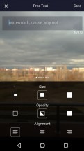
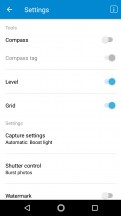
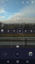
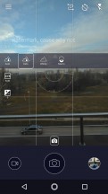
In there, you'll find handy features like a level and a compass, a guidelines overlay (rule of thirds) plus a watermarking tool. We already know Nokia's way of hiding the Manual mode in Capture settings. 'Manual' might be a bit of an overstatement, though - there's exposure compensation (-2/+2EV in full stop increments), white balance presets, a one-of-a-kind focus selector (auto/infinity/macro), and a metering mode selector.
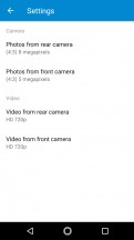
The settings menu has a few other options hidden away, some definitely more useful than others. If you really go overboard and enable everything, then go into Manual mode, the UI can frankly get way too busy.
Image quality
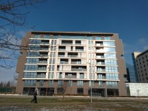
The Nokia 2's photos are pretty dismal, there's no need to sugarcoat it. They are low on detail, and there's a distinct softness to them. A consistent tendency to underexpose leaves you with dark images, and it's not like dynamic range is any good either. Add to that white balance that is off more often than not, and there's not much good we can say about the Nokia 2's camera. Okay, it'll do when there's nothing else around, but you won't be liking those shots.HDR
There's an HDR toggle in the Nokia 2's viewfinder and it cycles through off, auto and on. Auto doesn't always engage when we thought it should, so you might want to switch it on manually when you feel like it. The end result is often a bit extreme and outlandish, but it's not particularly bad, not that the bar is set too high.Panorama
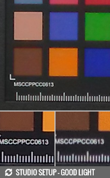
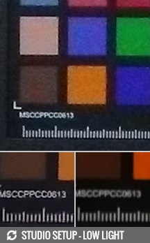
The Nokia 2 shoots panoramas too, albeit just basic ones. The images are a mere 900+ pixels tall, so there's not much detail to speak of. Stitching is okay, though.A quick trip to our Photo compare tool will also show you how the Nokia 2 renders the posters in our studio. We've pre-selected the Redmi 4A and the Xperia L1 to pit against the Nokia, but you can pick among all phones we've tested.
Selfies
The underwhelming camera experience continues on the front of the Nokia 2, where the 5MP fixed-focus camera is soft and fuzzy at arm's length, and doesn't get much sharper even if you poke your nose at the screen. Colors are okay, though, we guess.Video
The Nokia 2 records videos up to 720p, what year is it? Well, it's a Snapdragon 212 limitation, really, so Nokia's only to blame as far as it's responsible for picking the chip.The videos have a bit rate around 14.5Mbps, and audio is captured in stereo at 96kbps.
Much like the stills, there's not a lot to like about the Nokia 2's videos. They're soft and low on contrast, and a persistent focus hunting ruins them further.
You can download a video off our server (10s, 18MB) that hasn't been through YouTube's compression, though we can't see that doing much damage.
Competition
How can a Nokia have any competition? Especially the most affordable one, the Nokia 2. Okay, that's obviously a shout out to all the die-hard fans of the Finnish brand and not our official stance on the matter.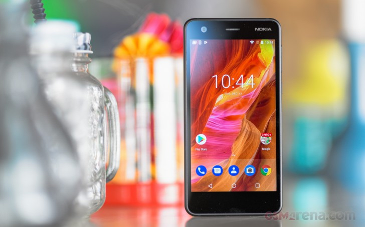 For competitors there certainly are. 100-dollar phones (or €120,
because of how taxes work on different sides of the Atlantic) typically
come from the far east and the likes of Xiaomi and Meizu have been
perfecting that game for a few generations of handsets. For example,
Xiaomi's Redmi 5A is the latest in a line of Redmis that deliver more
than what the price tag suggests, and that's also more that what the
Nokia 2 can offer - at pretty much the same price. The Snapdragon 425
may not be a powerhouse taken in isolation, but dwarfs the S212 of the
Nokia 2, and the Redmi 5A comes with at least 2GB of RAM and 16GB of
storage (3GB/32GB version is also available). The Redmi 4A is pretty
much the same thing. The Nokia has a bigger battery than both these two,
it needs to be said.
For competitors there certainly are. 100-dollar phones (or €120,
because of how taxes work on different sides of the Atlantic) typically
come from the far east and the likes of Xiaomi and Meizu have been
perfecting that game for a few generations of handsets. For example,
Xiaomi's Redmi 5A is the latest in a line of Redmis that deliver more
than what the price tag suggests, and that's also more that what the
Nokia 2 can offer - at pretty much the same price. The Snapdragon 425
may not be a powerhouse taken in isolation, but dwarfs the S212 of the
Nokia 2, and the Redmi 5A comes with at least 2GB of RAM and 16GB of
storage (3GB/32GB version is also available). The Redmi 4A is pretty
much the same thing. The Nokia has a bigger battery than both these two,
it needs to be said.Then there's the Redmi 4 (non-A). This one matches Nokia's battery capacity and ups the CPU to an octa-core unit for a notable increase in performance. All these Redmis have an upper hand in camera image quality too.
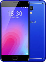
We also mentioned Meizu. The M6s is coming in a couple of weeks, but it's going to be an 18:9 phone, and possibly more expensive. The M6, however, is right in the Nokia's ballpark. It will give you slightly more screen estate than the Nokia (5.2" vs. 5.0") and better performance - octa-core CPU and 2GB/3GB of RAM and 16GB/32GB of storage to the Nokia's 1GB/8GB configuration.
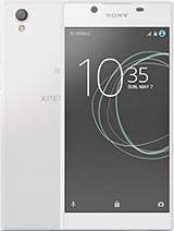
A Sony Xperia L1 can be found for a few more euros on top of the Nokia 2's price in Europe (though it's twice as expensive as the 2 in the US, go figure). For that, you'd be getting a larger 5.5-inch display (though same 720p resolution, so lower density), better performance, more RAM and storage, and slightly better camera. On the other hand, the Nokia's battery life is far out of reach of the Xperia.
Verdict
It's not a bad phone, this Nokia 2. It's just that there's only so much you can do within a budget this tight. And Nokia did a lot, actually - for a phone this affordable, the 2 has a pretty remarkable display, great build, and awesome battery life.Inevitably, corners were cut, and consequently performance is dismal while the 8GB of storage is extremely limiting. The camera output is barely passable too.
Pros
- Nice build, removable back, Nokia logo.
- Dedicated microSD slot.
- The display is bright, contrasty and sharp for the money.
- Battery life is excellent.
- Vanilla Android experience, promised Oreo update with Android Go optimizations.
- Price is as low as they come.
Cons
- Slow processor, very little RAM and storage, sluggish performance
- Mediocre cameras, front and back
- Slow charging










No comments:
Post a Comment